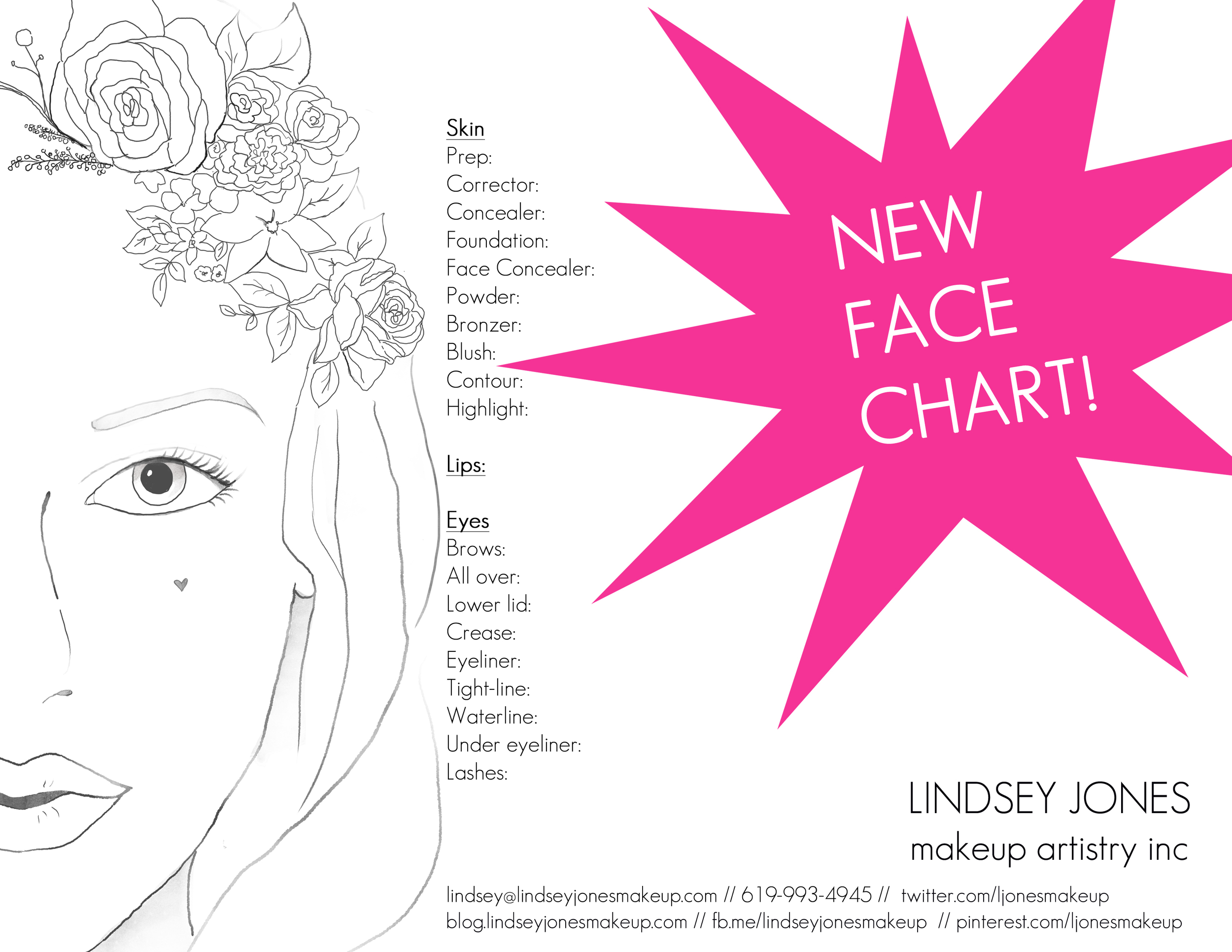
NEW Face Chart!
Can you spot the differences? I changed the Lindsey Jones Makeup Artistry logo and moved it down to the right. I also changed my font from Trade Gothic LT Std (Like Shu's) to Geosans Light which you can get for free here (thanks Pugly Pixel)! I also put more social media action onto the bottom of the chart. And instead of using a vertical bar | to separate my info, I decided to go with two forward slashes instead // (which I could have sworn I used to see a lot on Nowness). Face drawn by my favorite graphic designer, Tabitha Emma. As far as functionality goes, I changed the Lips section to just "Lips:" because I found that I just didn't need that much space. Also, I found that I was highlighting and contouring a lot more so I gave myself two different lines for that. I used to have the name and date at the bottom, but that made it very difficult to find in my files! So this time I didn't put "Name & Date" with a line, but rather just left space at the top. That way I can write whatever I desire, whether it be a designer's name and shoot date or a brides name and her wedding date. I've already started using the chart for my first two bridal makeup trials of 2013 and it was so refreshing to see a new, fresh and functional layout!


