How to design a face chart: a look at the creative process
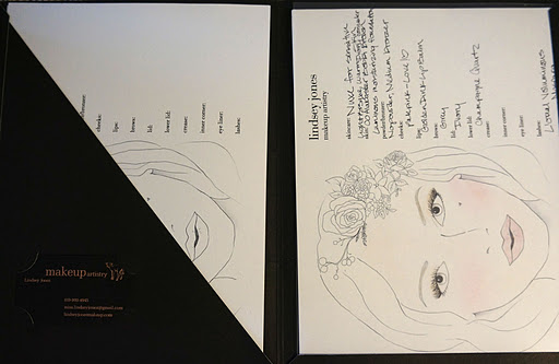
I decided a while ago that I needed a face chart. Face charts are a great way to show your clients the makeup look you have created for them. They usually consist of an illustration, an area to write and a brand logo. The illustration is colored in to show colors and pigment placement on the face. The area to write is great to describe the products, colors and techniques used. I am so happy that I will now have these little charts with me in my Zuca artistry kit! I wanted to share about the creative process behind designing the chart- so here you are!
Finished Face Chart!
The project began by Googling 'face charts'. Then I pinned all of the charts I did and didn't like on Pinterest here. I also pinned any sort of stylistic inspiration as well as illustrators that I liked. This is really important because you need to be able to convey what sort of face you want to whoever you hire to make the chart. I wanted a face chart to match the soft and pretty makeup I usually do. I also wanted an unconventional face chart- one that had personality and was highly stylistic- while still being pretty. I was inspired by Harajuku Pop art and Hipster BoHo Chic girls in New York.
Below is the very first draft- just computer paper and a pencil. I wanted to write out all the information that my client and I would need. I quickly realized that all the information I was trying to fit onto the page was taking up way too much space. I wouldn't have room for the illustration of the face. It just wasn't going to fit.
2nd Draft- No lines on this one.
3rd Draft- My illustrator, Tabitha, is awesome! I loved the face that she drew up! See below. I thought there was so much personality and that the face looked really, really pretty. And the more I looked at it the more I loved it. It was everything I had asked for in my Pinterest board and our exchange of emails, but better. She had gone above and beyond my expectations!
I was so excited to give the chart it's first test run! While I was filling out the chart I realized the eyes, and thus the face, needed to be slightly bigger. My smallest eyeshadow brushes wouldn't fit on the lids without getting shadow everywhere. To solve this problem we moved the client info section to the back and made the face larger. We also lightened the brows to show brow powder color. That, along with changing the black lines of the illustration to a grey, really softened the over all look. Lastly we changed the Logo to say Lindsey Jones first, and then makeup artistry.
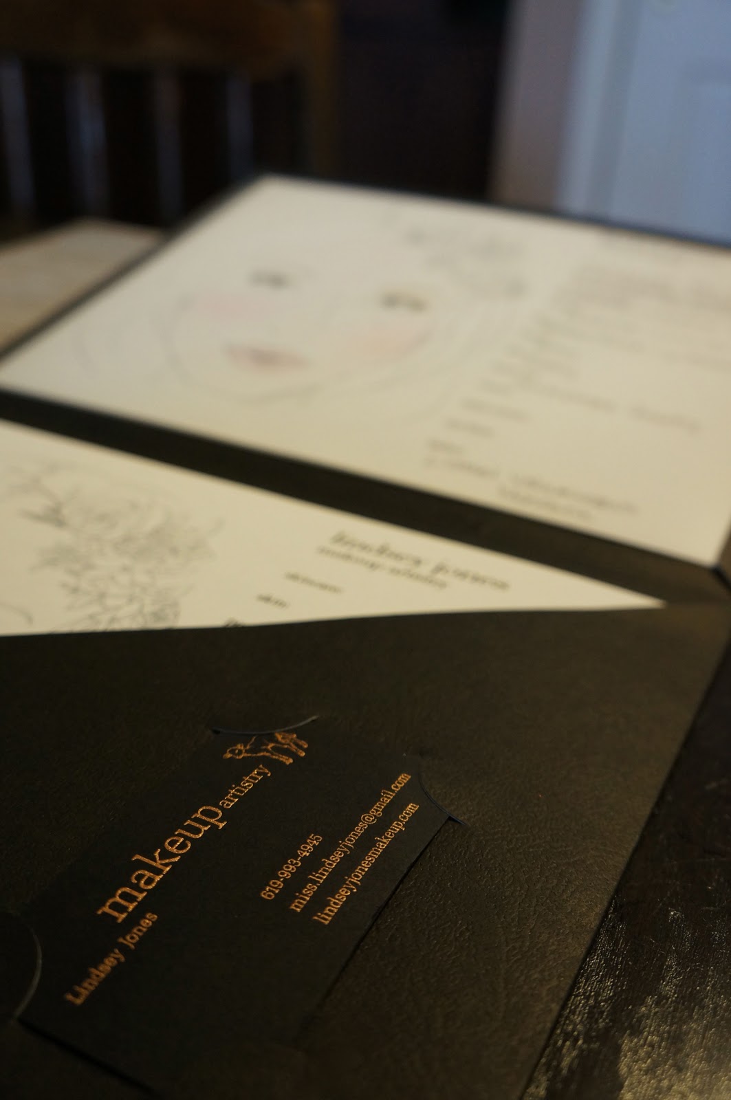
After Tabitha sent me my final draft (love!) I went to staples to get thick paper to print the charts on and a nice folder to keep them in. The paper needed to be thick enough for me to write with my Le Pen and also print double sided without the ink showing through. This folder has a pocket on the left and a clear 8 1/2x 11"pocket (which you can't see) on the right.
As you can see it fits perfectly on the side of my Zuca! And obviously I labeled the folder 'FACE CHARTS' with my pink label maker.
Does anybody want their very own Lindsey Jones Face Chart? :D
@ljonesmakeup
miss.lindseyjones (at) gmail.com


